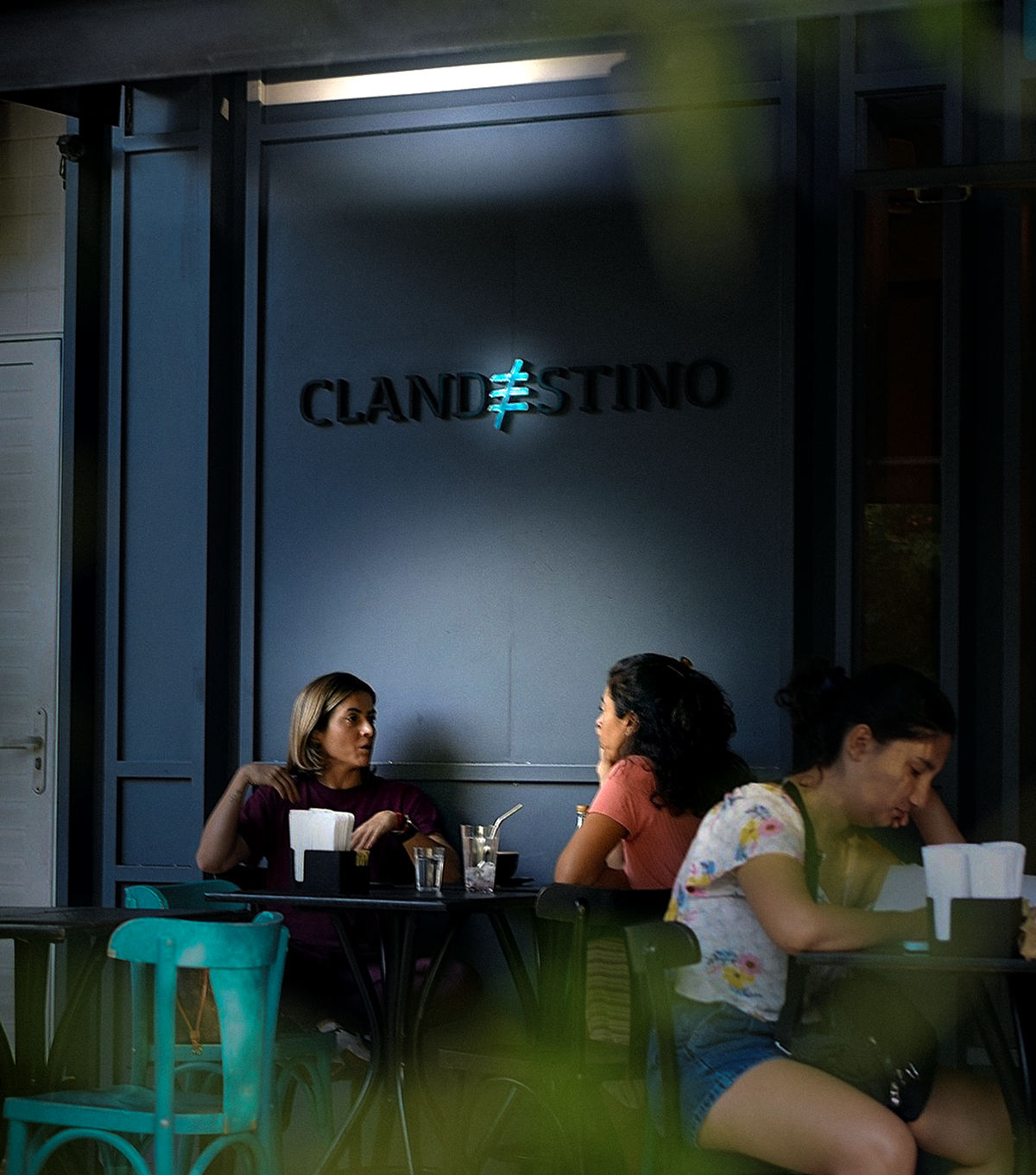
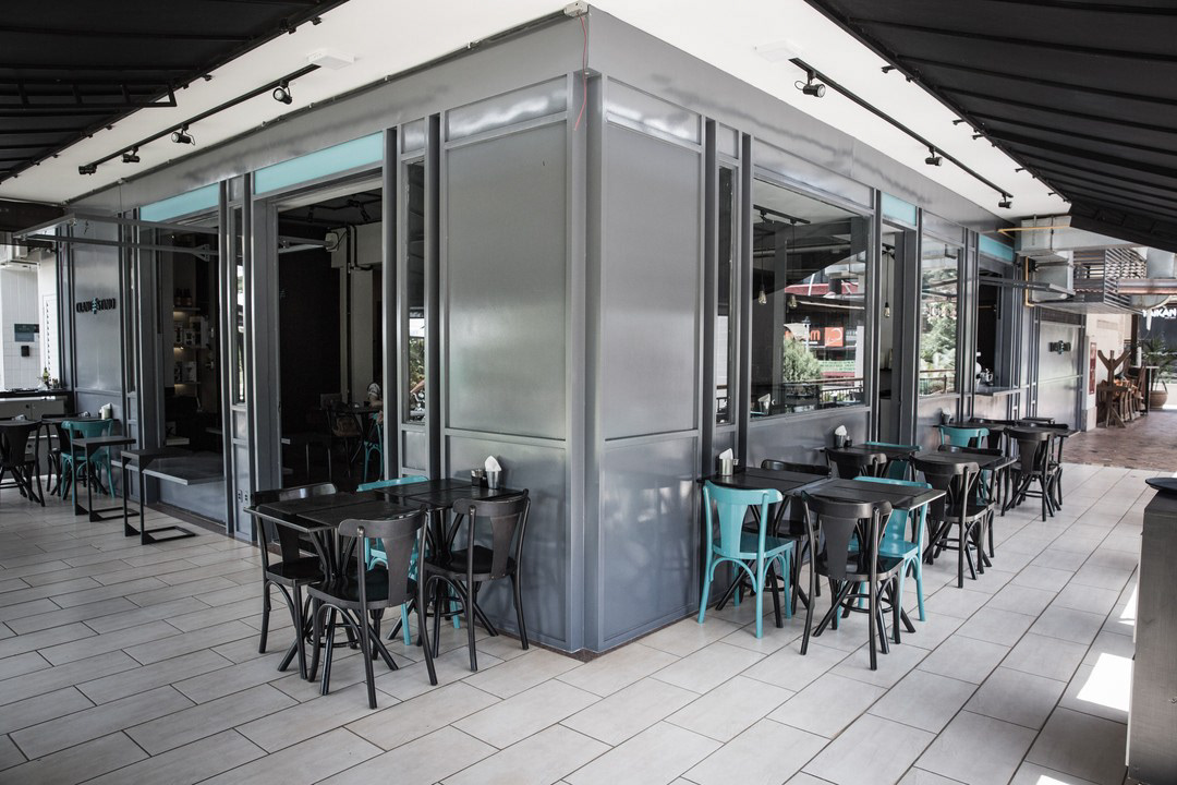
The café “Clandestino” was conceived as a disruptive space for experimentation, blending good music with a quest for excellence in coffee preparation. Like a laboratory, everything is measured, timed, and noted. They even say that being a barista there is equivalent to a PhD in the field.
The Process
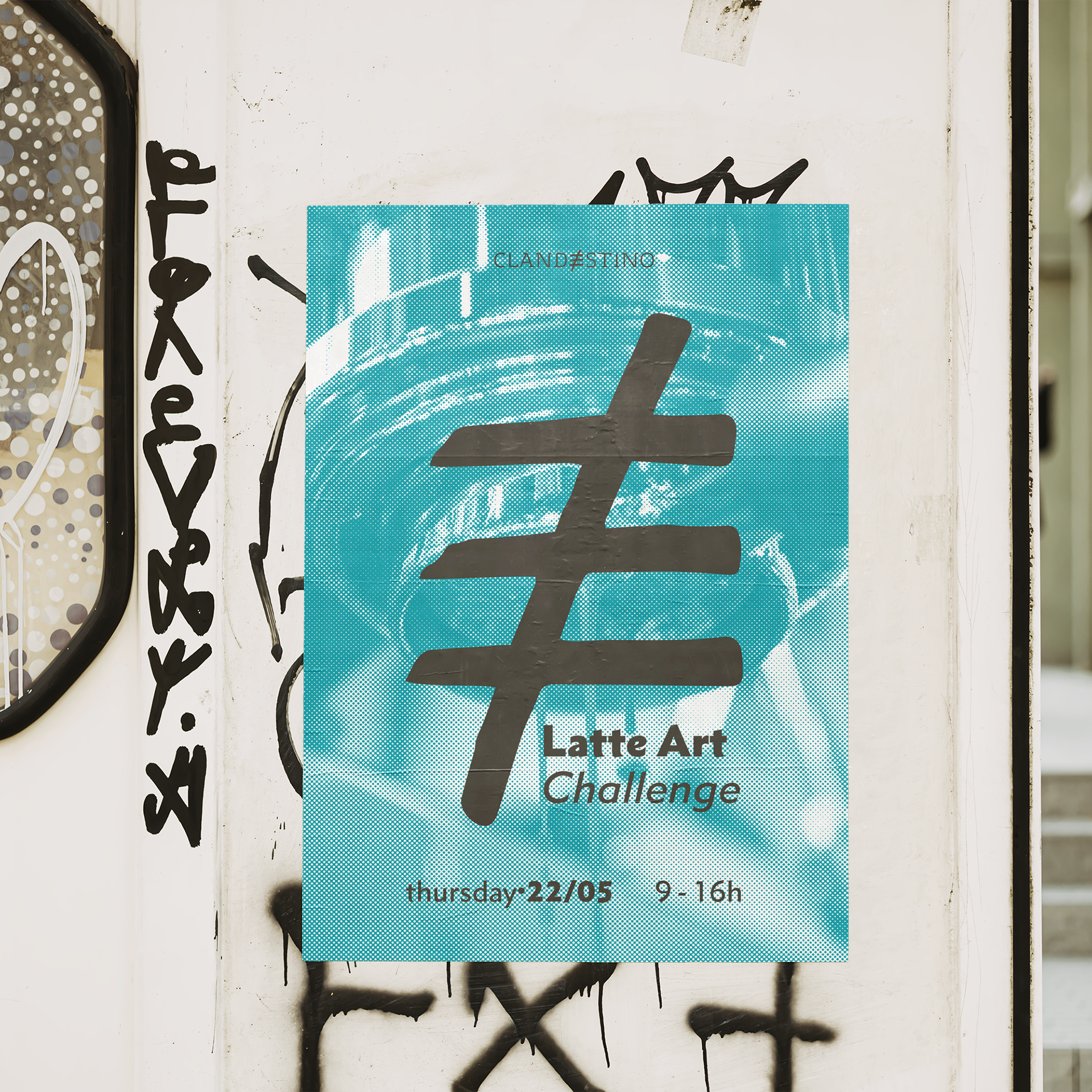
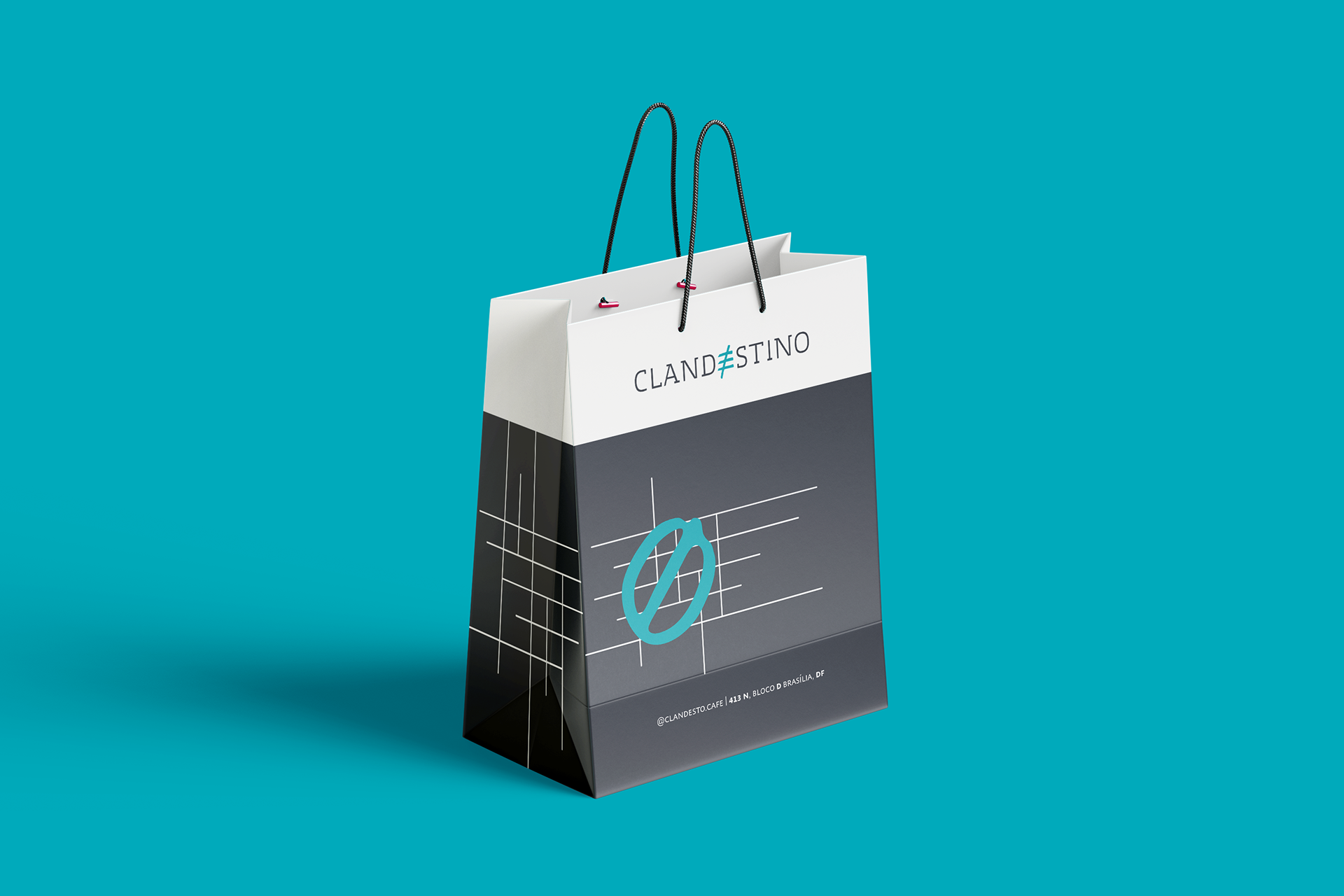
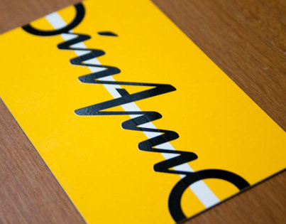
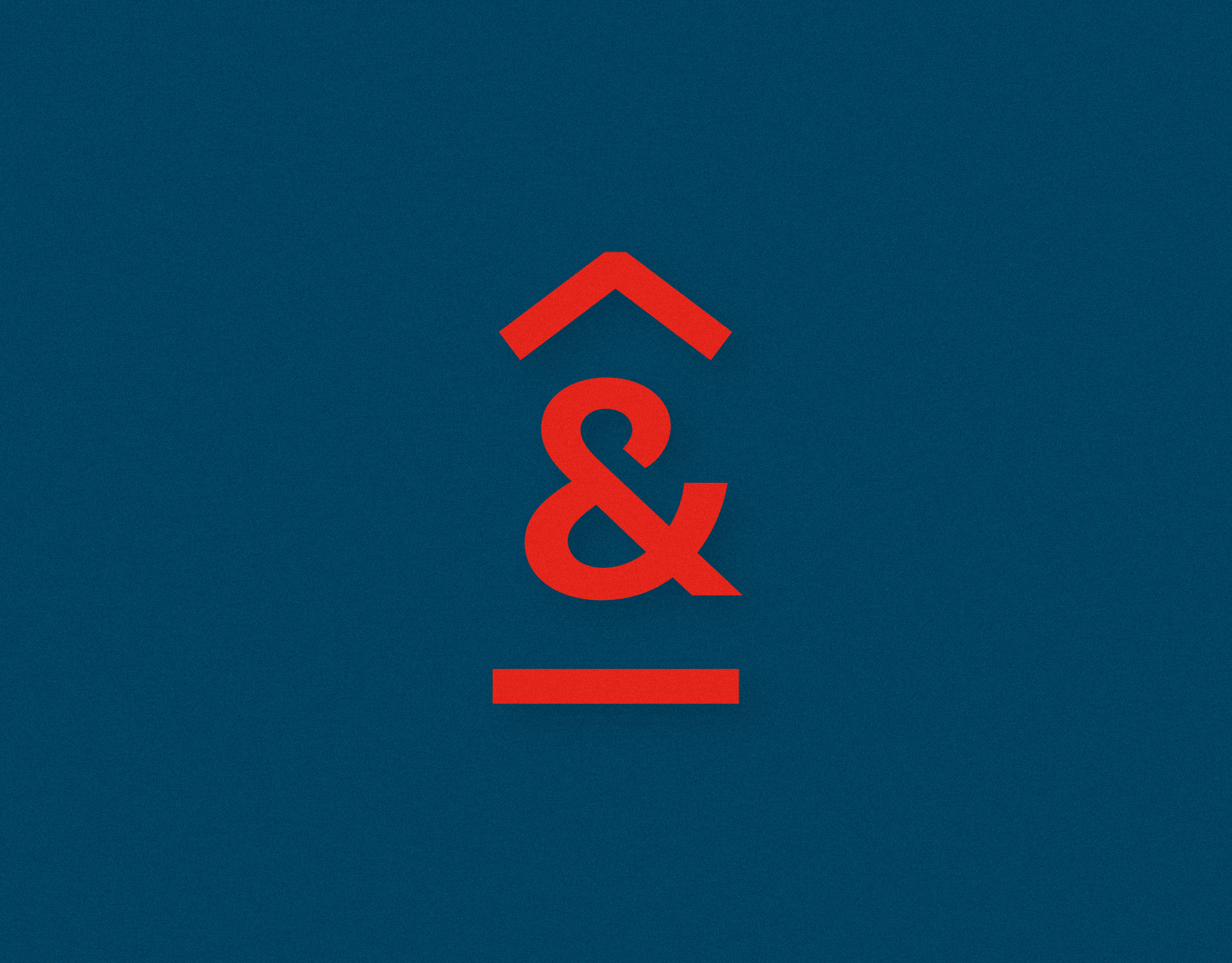
The very name ‘Clandestino’ already carries strong symbolism and meaning. For this project, we aimed to visually convey this significance in the logo. The letter ‘E,’ which is the central element of the name, has been transformed into a symbol with expressive and aggressive lines that contrast with the other more sober and geometric letters in the logo. The symbol serves as a focal point—a disruptive element that shouldn’t be there.
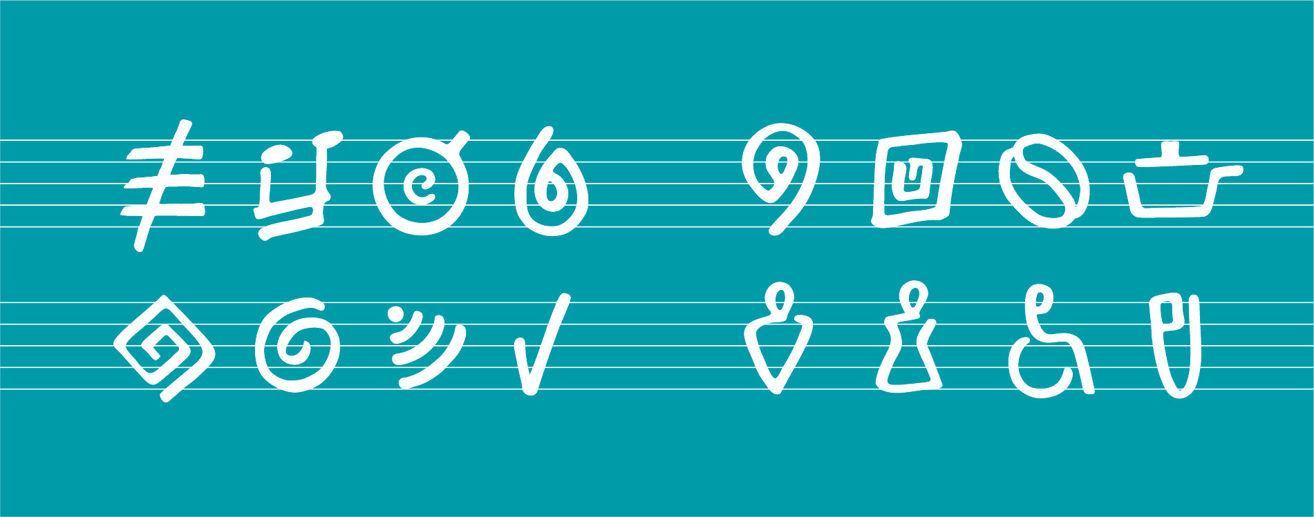
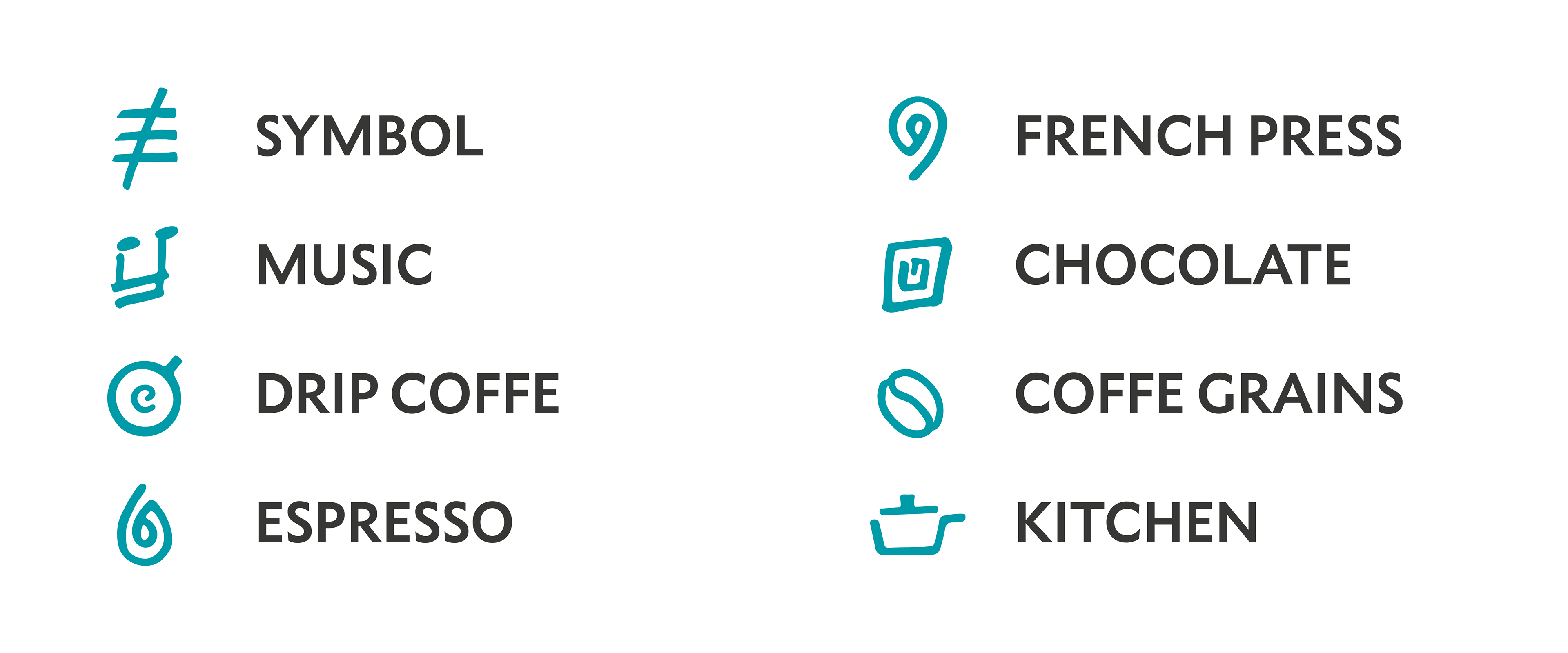
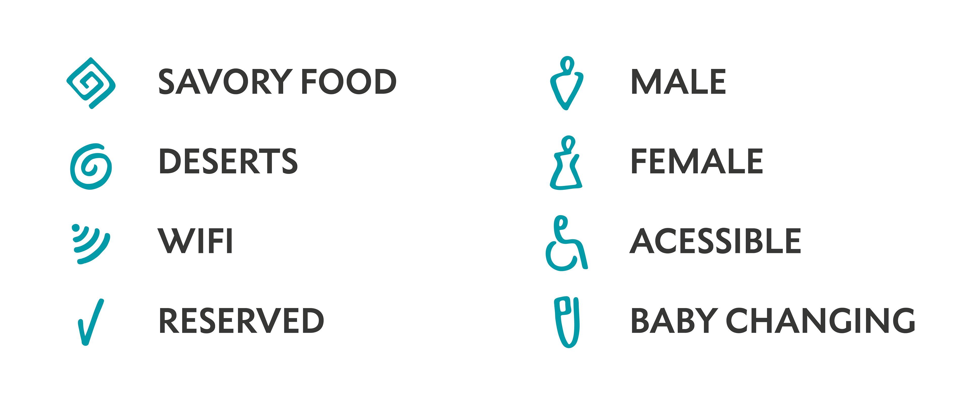
Icon Family
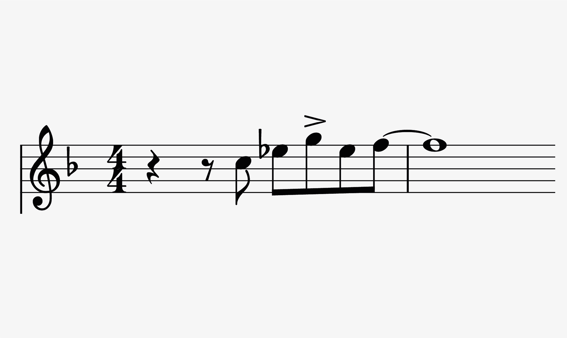
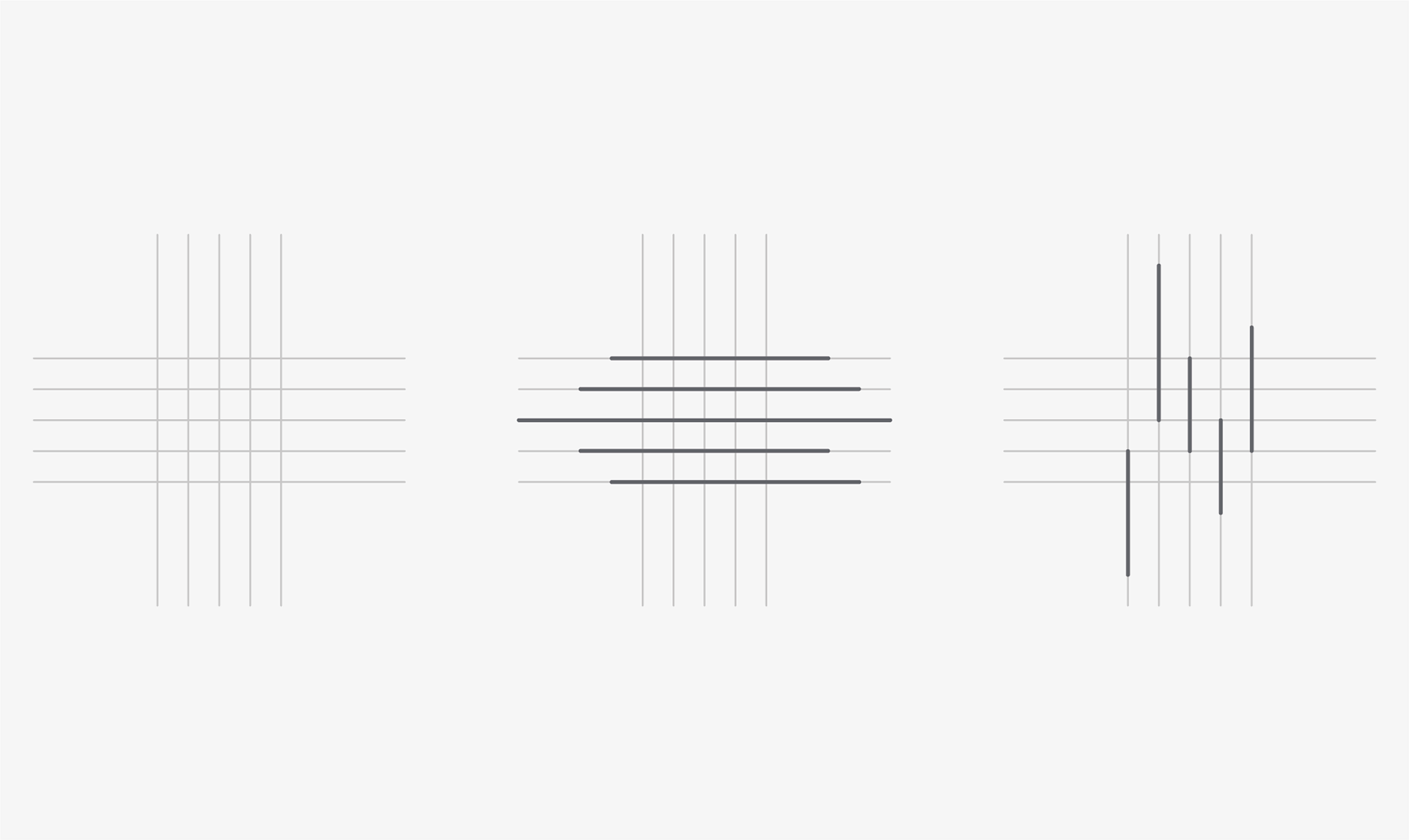
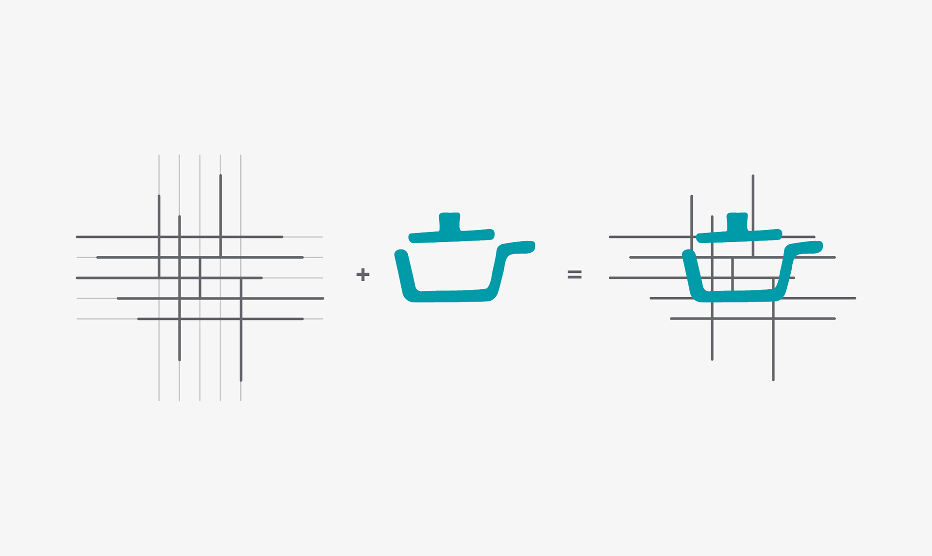
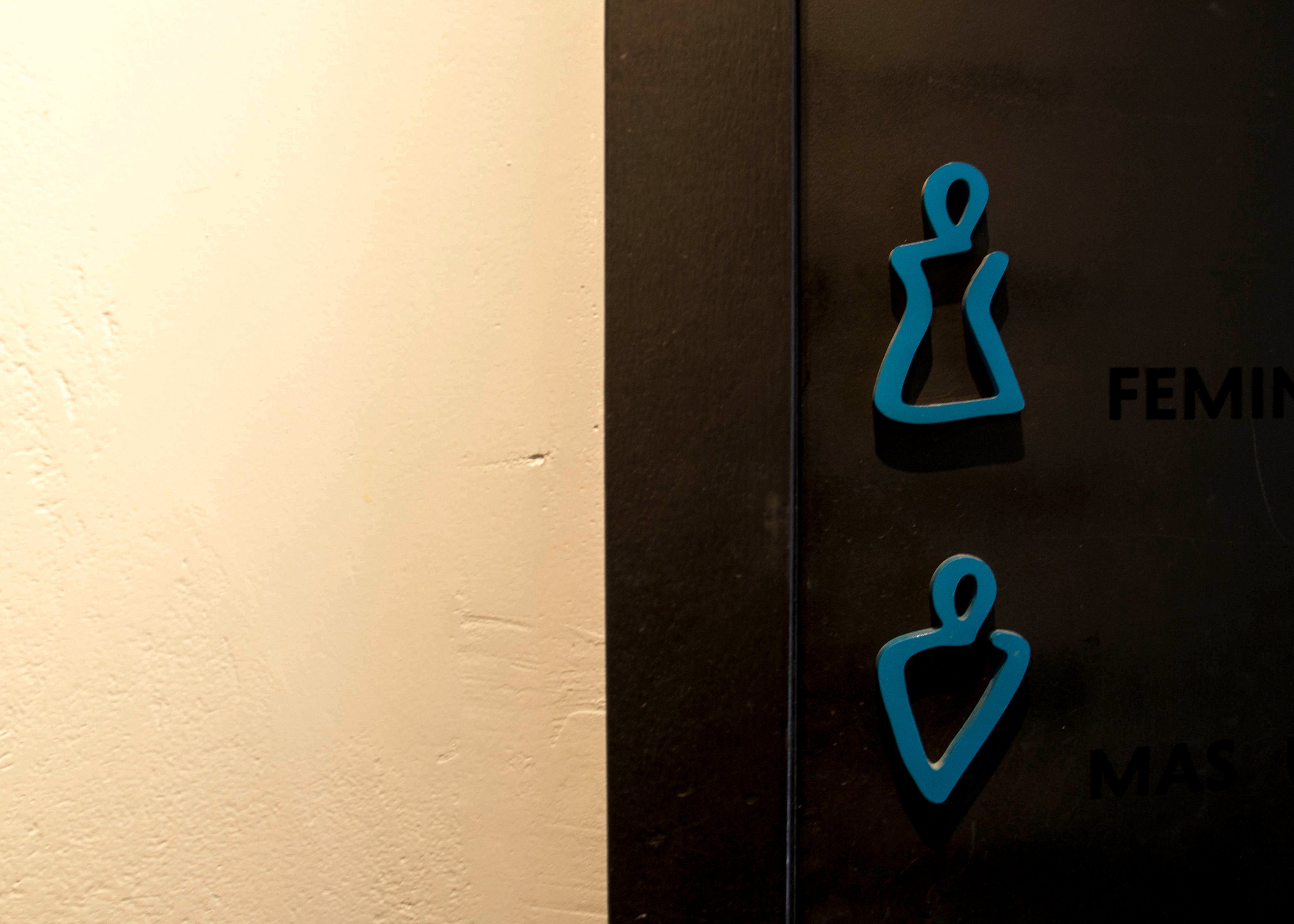
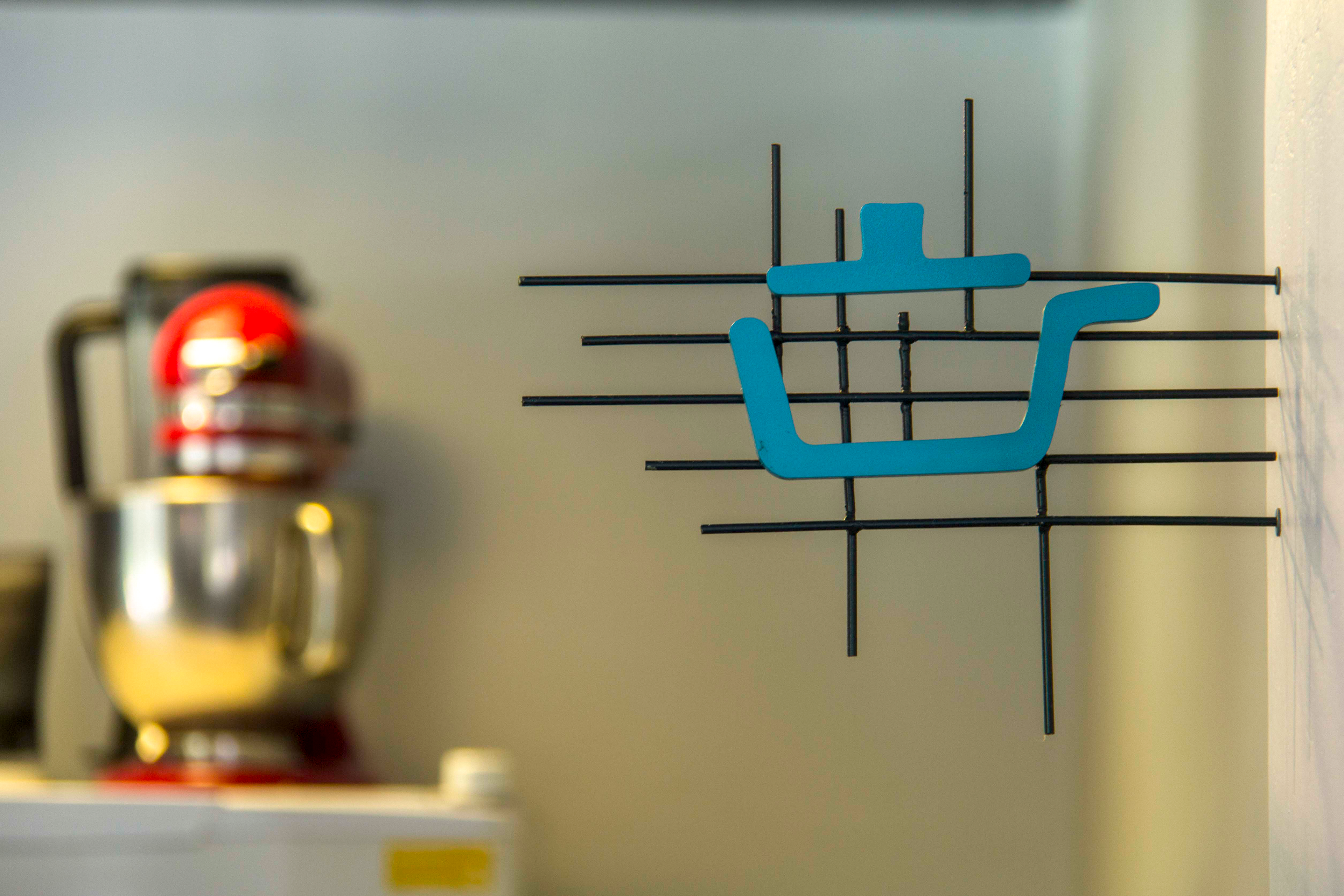
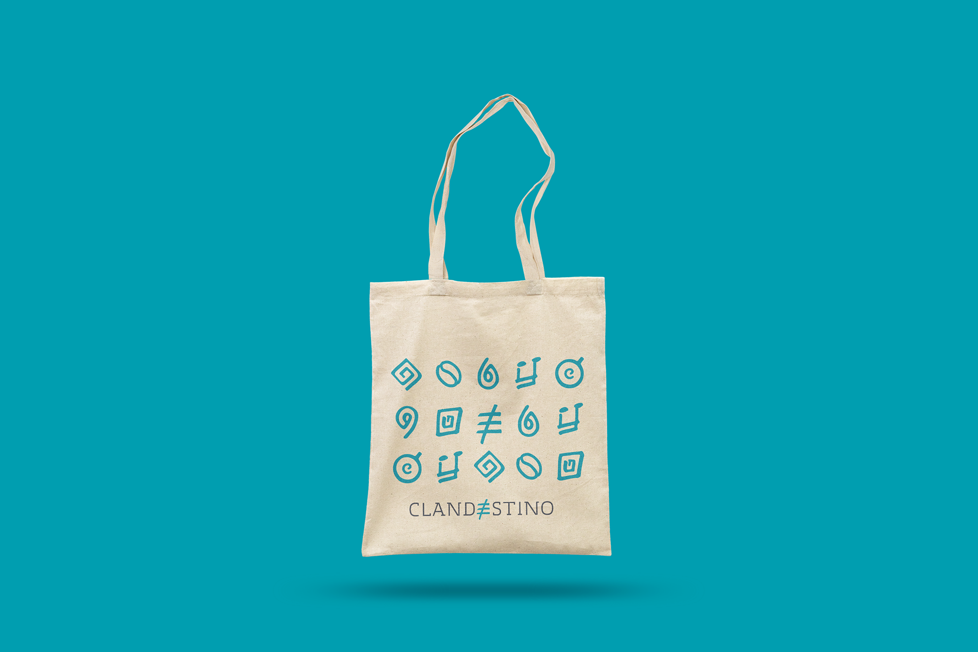
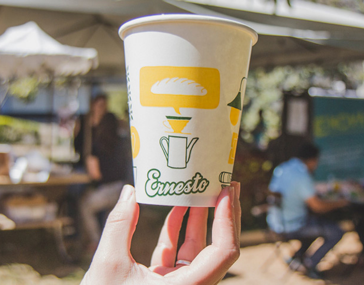
Based on the brand’s symbol and concept, we created a custom Icon Family. Since music is one of the key elements of the space, we envisioned incorporating it into the graphic solutions. Starting from the musical score, we designed a grid system to compose icons for various applications within the space.
